

CSS盒子居中的6种方法!
大家好, 我是'菜鸟',今天给大家带来几种css盒子居中的方法!
1.flex布局设置居中
常见的一种方式就是使用flex布局设置居中。

利用弹性布局(flex),实现水平居中,其中justify-content 用于设置弹性盒子元素在主轴(横轴)方向上的对齐方式
给容器设置:
-
display: flex;写在父元素上这就是定义了一个伸缩容器
-
justify-content 主轴对齐方式,默认是横轴
-
align-items 纵轴对齐方式,默认是纵轴
优点: 简单、方便、快速,三行代码搞定。
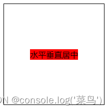
(图片来源网络,侵删).box { width: 200px; height: 200px; border: 1px solid; display: flex; align-items: center; // 纵轴对齐方式,默认是纵轴 子元素垂直居中 justify-content: center; //纵轴对齐方式,默认是纵轴 } .one { background: red; } 水平垂直居中运行后:
2.flex-给子项设置
.box {
  width: 200px;
  height: 200px;
  border: 1px solid;
  display: flex;
}
.child {
  background: red;
  margin: auto; // 水平垂直居中
}

  水平垂直居中
运行后:

3.定位:子绝父相
使用子绝父相的方式实现水平垂直居中。父元素设置position: relative。子元素设置 position: absolute; left: 50%; top: 50%; transfrom: translate(-50%, -50%);
.box {
  width: 200px;
  height: 200px;
  border: 1px solid;
  position: relative;
}
.child {
  position: absolute;
  left: 50%;
  top: 50%;
  transform: translate(-50%, -50%);
  background: red;
}

  水平垂直居中
运行后:
(图片来源网络,侵删)
4.tabel-cell实现垂直居中
css新增的table属性,可以让我们把普通元素,变为table元素的现实效果,通过这个特性也可以实现水平垂直居中
而且tabel单元格中的内容天然就是垂直居中的,只要添加一个水平居中属性就好了
-
使用tabel-cell实现垂直居中,容器设置 display: table-cell;;
-
vertical-align: middle属性设置元素的垂直对齐方式
-
子元素如果是块级元素,直接使用左右margin:auto实现水平居中。如果是行内元素,给容器设置text-align: center
利用 text-align: center 可以实现在块级元素内部的内联元素水平居中。此方法对内联元素inline, 内联块inline-block, 内联表inline-table, inline-flex元素水平居中都有效
.box {
  width: 200px;
  height: 200px;
  border: 1px solid;
  display: table-cell;
  vertical-align: middle;  // 设置元素在垂直方向上的对齐方式
  text-align: center;
}
.child {
  background: red;
  display: inline-block;
}

  水平垂直居中
运行后:

5.给容器加个伪元素
这是一种不常用的方法实现垂直居中。
给容器加个伪元素,设置line-height等于容器的高度。给子元素设置display: inline-block;
此种方式适合给文本设置水平垂直居中
.box {
  width: 200px;
  height: 200px;
  border: 1px solid;
  text-align: center;
}
.box::after {
  content: "";
  line-height: 200px;
}
.child {
  display: inline-block;
  background: red;
}


  水平垂直居中
运行后:

6.还有一种奇葩的方法
这个奇葩方式和第三种使用定位相似,
只不过需要给子元素设置 position: absolute; 设置固定宽度和高度;
top、left、bottom、right都设置为0; margin设置为auto;也能实现垂直水平居中
.box {
  width: 200px;
  height: 200px;
  border: 1px solid;
  position: relative;
}
.child {
  background: red;
  width: 100px;
  height: 40px;
  position: absolute;
  left: 0;
  top: 0;
  right: 0;
  bottom: 0;
  margin: auto;
}

  水平垂直居中
运行后:

以上就是一些我们常用的垂直居中的方法,咱们下期见!!!
-


")
")
")

还没有评论,来说两句吧...