

轻松掌握 CSS,实现 loading 加载中的多种形式
前言
现如今网页越来越趋近于动画,相信大家平时浏览网页或多或少都能看到一些动画效果,今天我们来做一个有意思的动画效果,纯 css 实现 loading 加载中(多种展现形式),下面一起看看吧。
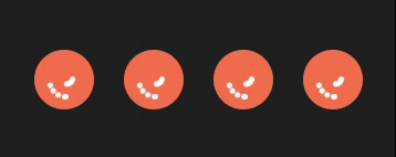
1. 常规 loading
实现效果

代码如下
.parentBox {
  height: 100%;
  background: rgb(31, 31, 31);
  padding: 100px;
  .loadBox .loaderContantBox {
    color: white;
    font-size: 40px;
    overflow: hidden;
    width: 40px;
    height: 40px;
    border-radius: 50%;
    transform: translateZ(0);
    /* animation:规定完成动画所花费的时间,该属性必须规定,否则动画时长为0,无法播放 */
    animation: loadBox 1.7s infinite ease, round 1.7s infinite ease;
  }
  @keyframes loadBox {
    0% {
      box-shadow: 0 -0.83em 0 -0.4em, 0 -0.83em 0 -0.42em, 0 -0.83em 0 -0.44em,
        0 -0.83em 0 -0.46em, 0 -0.83em 0 -0.477em;
    }
    5%,
    95% {
      box-shadow: 0 -0.83em 0 -0.4em, 0 -0.83em 0 -0.42em, 0 -0.83em 0 -0.44em,
        0 -0.83em 0 -0.46em, 0 -0.83em 0 -0.477em;
    }
    10%,
    59% {
      box-shadow: 0 -0.83em 0 -0.4em, -0.087em -0.825em 0 -0.42em,
        -0.173em -0.812em 0 -0.44em, -0.256em -0.789em 0 -0.46em,
        -0.297em -0.775em 0 -0.477em;
    }
    20% {
      box-shadow: 0 -0.83em 0 -0.4em, -0.338em -0.758em 0 -0.42em,
        -0.555em -0.617em 0 -0.44em, -0.671em -0.488em 0 -0.46em,
        -0.749em -0.34em 0 -0.477em;
    }
    38% {
      box-shadow: 0 -0.83em 0 -0.4em, -0.377em -0.74em 0 -0.42em,
        -0.645em -0.522em 0 -0.44em, -0.775em -0.297em 0 -0.46em,
        -0.82em -0.09em 0 -0.477em;
    }
    100% {
      box-shadow: 0 -0.83em 0 -0.4em, 0 -0.83em 0 -0.42em, 0 -0.83em 0 -0.44em,
        0 -0.83em 0 -0.46em, 0 -0.83em 0 -0.477em;
    }
  }
  @keyframes round {
    0% {
      transform: rotate(0deg); /* 开始旋转 div 元素 */
    }
    100% {
      transform: rotate(360deg); /* 结束旋转 div 元素 */
    }
  }
}
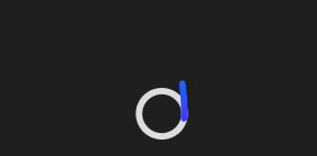
2. 抛出线条式 loading
实现效果
代码如下
.parentBox {
  height: 100%;
  background: rgb(31, 31, 31);
  padding: 100px;
  .scalableBox {
    width: 40px;
    height: 70px;
  }
  .apringBox {
    transition: stroke 0.3s;
  }
  .apwormOneBox,
  .apwormTwoBox {
    animation-duration: 3s;
    animation-iteration-count: infinite;
  }
  .apwormTwoBox {
    animation-name: worm2;
    visibility: hidden;
  }
  .apwormOneBox {
    animation-name: worm1;
  }
}
@media (prefers-color-scheme: dark) {
  :root {
    --bg: hsl(var(--hue), 10%, 10%);
    --fg: hsl(var(--hue), 10%, 90%);
  }
  .apringBox {
    stroke: hsla(var(--hue), 10%, 90%, 0.9);
  }
}
@keyframes worm1 {
  from {
    animation-timing-function: ease-in-out;
    stroke-dashoffset: -87.96;
  }
  20% {
    animation-timing-function: ease-in;
    stroke-dashoffset: 0;
  }
  60% {
    stroke-dashoffset: -791.68;
    visibility: visible;
  }
  60.1%,
  to {
    stroke-dashoffset: -791.68;
    visibility: hidden;
  }
}
@keyframes worm2 {
  from,
  60% {
    stroke-dashoffset: -87.96;
    visibility: hidden;
  }
  60.1% {
    animation-timing-function: cubic-bezier(0, 0, 0.5, 0.75);
    stroke-dashoffset: -87.96;
    visibility: visible;
  }
  77% {
    animation-timing-function: cubic-bezier(0.5, 0.25, 0.5, 0.88);
    stroke-dashoffset: -340;
    visibility: visible;
  }
  to {
    stroke-dashoffset: -669.92;
    visibility: visible;
  }
}
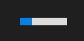
3. 进度条颜色覆盖式 loading
实现效果
代码如下
.parentBox {
  height: 100%;
  background: rgb(31, 31, 31);
  padding: 100px;
  .contantBox {
    width: 120px;
    height: 20px;
    background: linear-gradient(rgb(12, 132, 223) 0 0) 0/0% no-repeat #ddd;
    animation: cartoon 2s infinite linear;
  }
  @keyframes cartoon {
    100% {
      background-size: 100%;
    }
  }
}
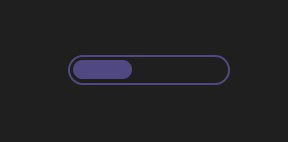
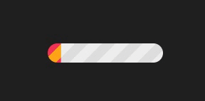
4. 椭圆式进度条 loading
实现效果
代码如下
.parentBox {
  height: 100%;
  background: rgb(31, 31, 31);
  padding: 100px;
  .contantBox {
    width: 120px;
    height: 22px;
    border-radius: 20px;
    color: #514b82;
    border: 2px solid;
    position: relative;
  }
  .contantBox::before {
    content: "";
    position: absolute;
    margin: 2px;
    inset: 0 100% 0 0;
    border-radius: inherit;
    background: #514b82;
    animation: cartoon 2s infinite;
  }
  @keyframes cartoon {
    100% {
      inset: 0;
    }
  }
}
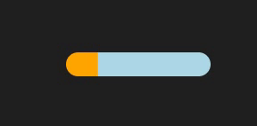
5. 卡顿式进度条 loading
实现效果
代码如下
.parentBox {
  height: 100%;
  background: rgb(31, 31, 31);
  padding: 100px;
  .contantBox {
    width: 120px;
    height: 20px;
    border-radius: 20px;
    background: linear-gradient(orange 0 0) 0/0% no-repeat lightblue;
    animation: cartoon 2s infinite steps(10);
  }
  @keyframes cartoon {
    100% {
      background-size: 110%;
    }
  }
}
6. 进度条波纹 loading
实现效果
代码如下
.parentBox {
  height: 100%;
  background: rgb(31, 31, 31);
  padding: 100px;
  .contantBox {
    width: 120px;
    height: 20px;
    border-radius: 20px;
    background: repeating-linear-gradient(
          135deg,
          #f03355 0 10px,
          #ffa516 0 20px
        )
        0/0% no-repeat,
      repeating-linear-gradient(135deg, #ddd 0 10px, #eee 0 20px) 0/100%;
    animation: cartoon 2s infinite;
  }
  @keyframes cartoon {
    100% {
      background-size: 100%;
    }
  }
}
7. 进度条分隔式 loading
实现效果
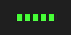
代码如下
.parentBox {
  height: 100%;
  background: rgb(31, 31, 31);
  padding: 100px;
  .contantBox {
    width: 120px;
    height: 20px;
    -webkit-mask: linear-gradient(90deg, #000 70%, #0000 0) 0/20%;
    background: linear-gradient(rgb(73, 255, 57) 0 0) 0/0% no-repeat #ddd;
    animation: cartoon 2s infinite steps(6);
  }
  @keyframes cartoon {
    100% {
      background-size: 120%;
    }
  }
}
8. 圆球连接式 loading
实现效果

代码如下
.parentBox {
  height: 100%;
  background: rgb(31, 31, 31);
  padding: 100px;
  .contantBox {
    width: 120px;
    height: 24px;
    -webkit-mask: radial-gradient(circle closest-side, #000 94%, #0000) 0 0/25%
        100%,
      linear-gradient(#000 0 0) center/calc(100% - 12px) calc(100% - 12px)
        no-repeat;
    background: linear-gradient(#25b09b 0 0) 0/0% no-repeat #ddd;
    animation: cartoon 2s infinite linear;
  }
  @keyframes cartoon {
    100% {
      background-size: 100%;
    }
  }
}
9. 电池充电式 loading
实现效果
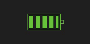
代码如下
.parentBox {
  height: 100%;
  background: rgb(31, 31, 31);
  padding: 100px;
  .contantBox {
    width: 80px;
    height: 40px;
    border: 2px solid rgb(103, 194, 58);
    padding: 3px;
    background: repeating-linear-gradient(
        90deg,
        rgb(103, 194, 58) 0 10px,
        #0000 0 16px
      )
      0/0% no-repeat content-box content-box;
    position: relative;
    animation: cartoon 2s infinite steps(6);
  }
  .contantBox::before {
    content: "";
    position: absolute;
    top: 50%;
    left: 100%;
    transform: translateY(-50%);
    width: 10px;
    height: 10px;
    border: 2px solid rgb(103, 194, 58);
  }
  @keyframes cartoon {
    100% {
      background-size: 120%;
    }
  }
}
10. 球体分隔式 loading
实现效果

代码如下
.parentBox {
  height: 100%;
  background: rgb(31, 31, 31);
  padding: 100px;
  .contantBox {
    width: 60px;
    height: 60px;
    border-radius: 50%;
    -webkit-mask: linear-gradient(0deg, #000 55%, #0000 0) bottom/100% 18.18%;
    background: linear-gradient(#f03355 0 0) bottom/100% 0% no-repeat #ddd;
    animation: cartoon 2s infinite steps(7);
  }
  @keyframes cartoon {
    100% {
      background-size: 100% 115%;
    }
  }
}
11. 水球波纹式 loading
实现效果
代码如下
.parentBox {
  height: 100%;
  background: rgb(31, 31, 31);
  padding: 100px;
  .contantBox {
    --r1: 154%;
    --r2: 68.5%;
    width: 60px;
    height: 60px;
    border-radius: 50%;
    background: radial-gradient(
          var(--r1) var(--r2) at top,
          #0000 79.5%,
          #269af2 80%
        )
        center left,
      radial-gradient(var(--r1) var(--r2) at bottom, #269af2 79.5%, #0000 80%)
        center center,
      radial-gradient(var(--r1) var(--r2) at top, #0000 79.5%, #269af2 80%)
        center right,
      #ccc;
    background-size: 50.5% 220%;
    background-position: -100% 0%, 0% 0%, 100% 0%;
    background-repeat: no-repeat;
    animation: cartoon 2s infinite linear;
  }
  @keyframes cartoon {
    33% {
      background-position: 0% 33%, 100% 33%, 200% 33%;
    }
    66% {
      background-position: -100% 66%, 0% 66%, 100% 66%;
    }
    100% {
      background-position: 0% 100%, 100% 100%, 200% 100%;
    }
  }
}
12. 半圆线条式 loading
实现效果

代码如下
.parentBox {
  height: 100%;
  background: rgb(31, 31, 31);
  padding: 100px;
  .contantBox {
    width: 120px;
    height: 60px;
    border-radius: 200px 200px 0 0;
    -webkit-mask: repeating-radial-gradient(
      farthest-side at bottom,
      #0000 0,
      #000 1px 12%,
      #0000 calc(12% + 1px) 20%
    );
    background: radial-gradient(farthest-side at bottom, #514b82 0 95%, #0000 0)
      bottom/0% 0% no-repeat #ddd;
    animation: cartoon 2s infinite steps(6);
  }
  @keyframes cartoon {
    100% {
      background-size: 120% 120%;
    }
  }
}
13. 球体内小球跳跃式 loading
实现效果
代码如下
.parentBox {
  height: 100%;
  background: rgb(31, 31, 31);
  padding: 100px;
  display: flex;
  @keyframes move {
    from {
      transform: translate(0, 50%);
    }
    to {
      transform: translate(0, 850%);
    }
  }
  figure {
    margin: 10px;
    width: 40px;
    height: 40px;
    border-radius: 50%;
    position: relative;
    background: rgb(240,109,78);
  }
  section {
    width: 10%;
    height: 100%;
    position: absolute;
    left: 45%;
  }
  section:nth-child(2) {
    transform: rotate(22.5deg);
  }
  section:nth-child(3) {
    transform: rotate(45deg);
  }
  section:nth-child(4) {
    transform: rotate(67.5deg);
  }
  section:nth-child(5) {
    transform: rotate(90deg);
  }
  section:nth-child(6) {
    transform: rotate(112.5deg);
  }
  section:nth-child(7) {
    transform: rotate(135deg);
  }
  section:nth-child(8) {
    transform: rotate(157.5deg);
  }
  figure div {
    height: 10%;
    border-radius: 50%;
    background: #fff;
    animation: move 1s ease-in-out infinite alternate;
  }
  figure:nth-child(1) > section:nth-child(1) > div {
    animation-delay: -0.1875s;
  }
  figure:nth-child(1) > section:nth-child(2) > div {
    animation-delay: -0.175s;
  }
  figure:nth-child(1) > section:nth-child(3) > div {
    animation-delay: -0.1625s;
  }
  figure:nth-child(1) > section:nth-child(4) > div {
    animation-delay: -0.15s;
  }
  figure:nth-child(1) > section:nth-child(5) > div {
    animation-delay: -0.9375s;
  }
  figure:nth-child(1) > section:nth-child(6) > div {
    animation-delay: -0.925s;
  }
  figure:nth-child(1) > section:nth-child(7) > div {
    animation-delay: -0.9125s;
  }
  figure:nth-child(1) > section:nth-child(8) > div {
    animation-delay: -0.9s;
  }
  figure:nth-child(2) > section:nth-child(1) > div {
    animation-delay: -0.875s;
  }
  figure:nth-child(2) > section:nth-child(2) > div {
    animation-delay: -0.75s;
  }
  figure:nth-child(2) > section:nth-child(3) > div {
    animation-delay: -0.625s;
  }
  figure:nth-child(2) > section:nth-child(4) > div {
    animation-delay: -0.5s;
  }
  figure:nth-child(2) > section:nth-child(5) > div {
    animation-delay: -0.375s;
  }
  figure:nth-child(2) > section:nth-child(6) > div {
    animation-delay: -0.25s;
  }
  figure:nth-child(2) > section:nth-child(7) > div {
    animation-delay: -0.125s;
  }
  figure:nth-child(3) > section:nth-child(1) > div {
    animation-delay: -0.5s;
  }
  figure:nth-child(3) > section:nth-child(3) > div {
    animation-delay: -0.5s;
  }
  figure:nth-child(3) > section:nth-child(5) > div {
    animation-delay: -0.5s;
  }
  figure:nth-child(3) > section:nth-child(7) > div {
    animation-delay: -0.5s;
  }
  figure:nth-child(4) > section:nth-child(1) > div {
    animation-delay: -0.35s;
  }
  figure:nth-child(4) > section:nth-child(2) > div {
    animation-delay: -0.3s;
  }
  figure:nth-child(4) > section:nth-child(3) > div {
    animation-delay: -0.25s;
  }
  figure:nth-child(4) > section:nth-child(4) > div {
    animation-delay: -0.2s;
  }
  figure:nth-child(4) > section:nth-child(5) > div {
    animation-delay: -0.15s;
  }
  figure:nth-child(4) > section:nth-child(6) > div {
    animation-delay: -0.1s;
  }
  figure:nth-child(4) > section:nth-child(7) > div {
    animation-delay: -0.05s;
  }
}
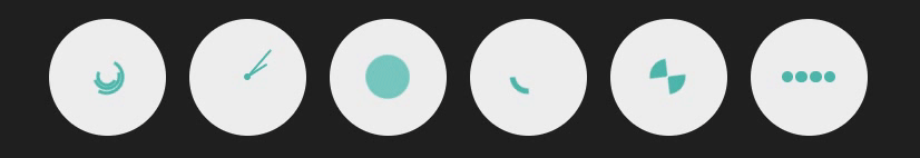
14. 球体内动图式 loading
实现效果
代码如下
.parentBox {
  height: 100%;
  background: rgb(31, 31, 31);
  padding: 100px;
  .containerBox {
    display: flex;
    .canvasBox {
      align-items: center;
      background: #eeeeee;
      border-radius: 50%;
      display: flex;
      justify-content: center;
      margin: 1em;
      width: 10em;
      height: 10em;
      // 第一种
      .spinnerOneBox {
        align-items: center;
        border: 0.3em solid transparent;
        border-top: 0.3em solid #4db6ac;
        border-right: 0.3em solid #4db6ac;
        border-radius: 100%;
        display: flex;
        justify-content: center;
      }
      .spinnerMaxBox {
        animation: spinnerOne 3s linear infinite;
        height: 3em;
        width: 3em;
        .spinnerMidBox {
          animation: spinnerOne 5s linear infinite;
          height: 2.4em;
          width: 2.4em;
          .spinnerMinBox {
            animation: spinnerOne 5s linear infinite;
            height: 1.8em;
            width: 1.8em;
          }
        }
      }
    }
    @keyframes spinnerOne {
      0% {
        transform: rotate(0deg);
      }
      100% {
        transform: rotate(360deg);
      }
    }
    // 第二种
    .canvasTwoBox {
      position: relative;
      .spinnerTwoBox {
        animation: spinnerTwo 1s linear infinite;
        background: #4db6ac;
        border-radius: 100px;
        height: 3em;
        transform-origin: top;
        position: absolute;
        top: 50%;
        width: 0.22em;
      }
      .hourHandBox {
        animation: spinnerTwo 7s linear infinite;
        background: #4db6ac;
        border-radius: 100px;
        height: 2em;
        transform-origin: top;
        position: absolute;
        top: 50%;
        width: 0.2em;
      }
      .dotBox {
        background: #4db6ac;
        border-radius: 100%;
        height: 0.5em;
        width: 0.5em;
      }
    }
    @keyframes spinnerTwo {
      0% {
        transform: rotate(0deg);
      }
      100% {
        transform: rotate(360deg);
      }
    }
    // 第三种
    .spinnerThreeBox {
      animation: spinnerThree 1s linear infinite;
      background: #4db6ac;
      border-radius: 100%;
      width: 3em;
      height: 3em;
    }
    @keyframes spinnerThree {
      0%,
      35% {
        background: #4db6ac;
        transform: scale(1);
      }
      20%,
      50% {
        background: #80cbc4;
        transform: scale(1.3);
      }
    }
    // 第四种
    .spinnerFourBox {
      animation: spinnerFour 1s linear infinite;
      border: solid 7px transparent;
      border-top: solid 7px #4db6ac;
      border-radius: 100%;
      width: 3em;
      height: 3em;
    }
    @keyframes spinnerFour {
      0% {
        transform: rotate(0deg);
      }
      100% {
        transform: rotate(360deg);
      }
    }
    // 第五种
    .spinnerFiveBox {
      animation: spinnerFive 1s linear infinite;
      border: solid 1.5em #4db6ac;
      border-right: solid 1.5em transparent;
      border-left: solid 1.5em transparent;
      border-radius: 100%;
      width: 0;
      height: 0;
    }
    @keyframes spinnerFive {
      0% {
        transform: rotate(0deg);
      }
      50% {
        transform: rotate(60deg);
      }
      100% {
        transform: rotate(360deg);
      }
    }
    // 第六种
    .spinnerSexBox {
      background: #4db6ac;
      border-radius: 50%;
      height: 1em;
      margin: 0.1em;
      width: 1em;
    }
    .p1 {
      animation: fall 1s linear 0.3s infinite;
    }
    .p2 {
      animation: fall 1s linear 0.2s infinite;
    }
    .p3 {
      animation: fall 1s linear 0.1s infinite;
    }
    .p4 {
      animation: fall 1s linear infinite;
    }
    @keyframes fall {
      0% {
        transform: translateY(-15px);
      }
      25%,
      75% {
        transform: translateY(0);
      }
      100% {
        transform: translateY(-15px);
      }
    }
  }
}
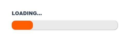
15. 渐变加载 loading
实现效果
代码如下
.parentBox { height: 100%; padding: 100px; .containerBox { font-weight: 900; padding-bottom: 10px; span { animation: load-text 1s infinite cubic-bezier(0.1, 0.15, 0.9, 1); display: inline-block; } } .progBox { background-color: #eaeaea; width: 300px; height: 25px; box-shadow: 1px 0px 2px rgba(0, 0, 0, 0.25), 0px 1px 2px rgba(0, 0, 0, 0.25); border-radius: 10px; position: relative; } .progBox:after { content: ""; background-color: green; position: absolute; border-radius: 10px; width: 100%; height: 100%; top: 0px; left: 0px; animation: load 4s infinite linear; } @keyframes load { 0% { width: 5%; background-color: red; } 25% { background-color: orange; } 50% { background-color: yellow; } 75% { background-color: lightgreen; } 90% { background-color: green; width: 100%; } } @keyframes load-text { 0% { transform: translateY(0px); } 25% { transform: translateY(5px); } 50% { transform: translateY(0px); } 75% { transform: translateY(-5px); } 100% { transform: translateY(0px); } } }L O A D I N G . . .
持续更新中...
文章版权声明:除非注明,否则均为主机测评原创文章,转载或复制请以超链接形式并注明出处。
")
")
")

还没有评论,来说两句吧...