

Python 解析CSV文件 使用Matplotlib绘图
数据存储在CSV文件中,使用Matplotlib实现数据可视化。

(图片来源网络,侵删)
CSV文件:comma-separated values,是在文件中存储一系列以‘,’分隔的值。
例如:"0.0","2016-01-03","1","3","2016","Birmingham","BHM","Birmingham, AL","Alabama","39","46","32","33","4.33"
本文使用的CSV文件是一组天气数据。
Matplotlib绘图代码如下:
import csv
import matplotlib.pyplot as plt
plt.rcParams['font.sans-serif']=['SimHei']#为显示中文设置字体
from datetime import datetime
filename = 'data/weather.csv'
with open(filename) as f:
reader = csv.reader(f)
header_row = next(reader)
# for index,info in enumerate(header_row):
# print(index,info)
# 0 Data.Precipitation
# 1 Date.Full
# 2 Date.Month
# 3 Date.Week of
# 4 Date.Year
# 5 Station.City
# 6 Station.Code
# 7 Station.Location
# 8 Station.State
# 9 Data.Temperature.Avg Temp
# 10 Data.Temperature.Max Temp
# 11 Data.Temperature.Min Temp
# 12 Data.Wind.Direction
# 13 Data.Wind.Speed
#从文件中获得特定地点Birmingham信息
Birmingham_highs, Birmingham_lows= [],[]
Birmingham_dates = []
for row in reader:
if row[5] == 'Birmingham':
date = datetime.strptime(row[1], '%Y-%m-%d')
high = int(row[10])
low = int(row[11])
Birmingham_dates.append(date)
Birmingham_highs.append(high)
Birmingham_lows.append(low)
plt.style.use('Solarize_Light2')
fig,ax = plt.subplots(figsize=(10,6))#设置窗口尺寸
ax.plot(Birmingham_dates,Birmingham_highs,linewidth=3,c='red',alpha=0.5)#绘制最高温折线,红色,透明度0.5
ax.plot(Birmingham_dates,Birmingham_lows,linewidth=3,c='blue',alpha=0.5)#绘制最低温折线
ax.fill_between(Birmingham_dates,Birmingham_highs,Birmingham_lows,facecolor='yellow',alpha=0.1)#填充中间区域
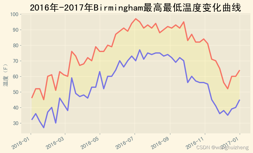
ax.set_title('2016年-2017年Birmingham最高最低温度变化曲线',fontsize=24)
ax.set_xlabel('',fontsize=14)
fig.autofmt_xdate()#绘制倾斜的日期标签
ax.set_ylabel('温度(F)',fontsize=14)
ax.tick_params(axis='both',which='major',labelsize=14)
plt.savefig('Birmingham_temperature.png',bbox_inches='tight')#将绘制的图形保存为文件
plt.show()
运行结果如下:

(图片来源网络,侵删)

(图片来源网络,侵删)
文章版权声明:除非注明,否则均为主机测评原创文章,转载或复制请以超链接形式并注明出处。
")
")
")
还没有评论,来说两句吧...